
Forum OpenACS Q&A: Carl's 3rd Design Iteration
This is why I would like to continue the discussion and see a poll.
I have taken comments above an tried to integrate them into the design.
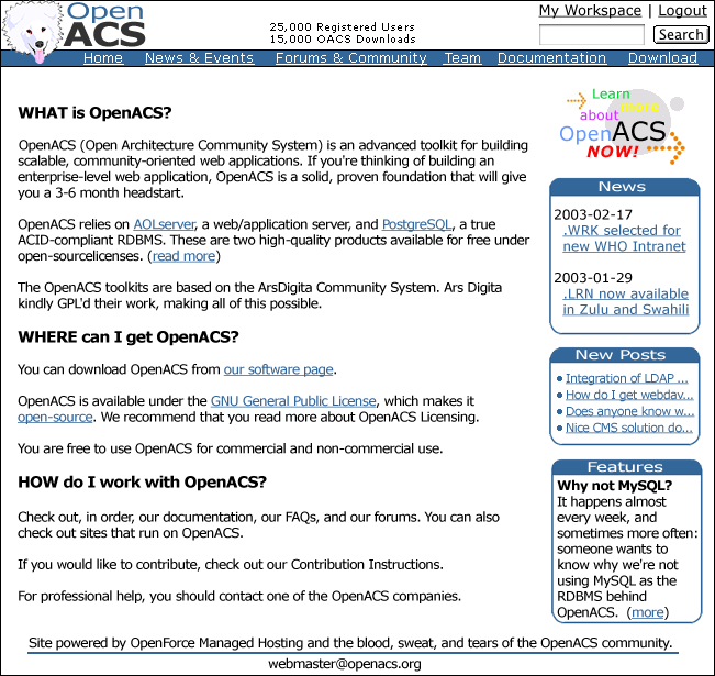
Some comments:
- Reduced the size of the top banner (although the start page banner might be a little bigger, which might allow the login dialog to appear up top)
- Changed the search button to the Microsoft version (Lars was right, I use an Apple and that search button is the result of a screen shot. In other words: it was not a "me-too" homage, but the real thing 😉
- I liked the colorful download link in the first design, which is why I decided to integrate it into this one, yet I agree with Tilmann and Lars: it would be better to link to a demo site (the OACS installation is quite an act and probably not a factor we want to use as a marketing tool). I can easily change that to "Try OpenACS NOW!".
- Fixed the case in the logo... it now reads OpenACS instead of OPENACS
- Used more of the available whitespace. Also: the design will not be of fixed width (although I started it with the small screens in mind). The content density should be determined by the users browser settings (I want to keep the site as accessible as possible), but it should be easy to make the default size smaller.
- I also want sub-second response times. I want the pages to load quickly (which is why I think I can implement this design with less than 10K). On the web the time factor makes the design an engineering problem.
I also quickly put together a dummy content page (could be linked from the "Learn more about OpenACS" button) with a diagram that I am working on:

The graphic's colors should give a Lego like impression (that is the feeling I get from the toolkit). That button also played a role in the color choice. Although this can be easily changed (It would probably be better to go with pastels that get out of the way of the content).
Unlike dotLRN which uses the Legos to create a complete packaged application, OACS in its present form is something that developers can use to tackle problems. I think we have to keep this in mind, that this IS a developer site. I want developers to find things on this site... and find them quickly. Obviously we need to make the site look good and create a space for decision makers (with some diagrams and case studies) as well as other members of a growing community, but isn't this what the subsite package is for? This site is about a toolkit and it needs to cater to the people that are willing to roll up their sleeves a make cool things.