Overview
Through the OpenACS templating system, the UI look&feel will be modifiable by specific sites, so we needn't address page layout and graphical design issues here. Other than to mention that the Assessment package will use these OpenACS standards:
- "trail of breadcrumb" navigational links
- context-aware (via user identity => permissions) menu options (whether those "menus" are literally menus or some other interface widget like toolbars)
- in-place, within-form user feedback (eg error messages about a form field directly next to that field, not in an "error page")
Furthermore, the set of necessary pages for Assessment are not all that dissimilar to the set required by any other OpenACS package. We need to be able to create, edit and delete all the constituent entities in the Package. The boundary between the pages belonging specifically to Assessment and those belonging to "calling" packages (eg dotLRN, clinical trials packages, financial management packages, etc etc) will necessarily be somewhat blurred.
Proposed Page Flow
Nevertheless, here is a proposed set of pages along with very brief descriptions of what happens in each. This organization is actually derived mostly from the existing Questionnaire module which can be examined here in the "Bay Area OpenACS Users Group (add yourself to the group and have a look).
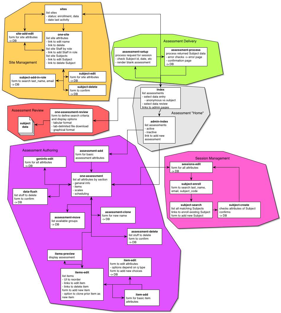
The UI for Assessment divides into a number of primary functional areas, as diagrammed below. These include:
- the "Home" area (for lack of a better term). These are the main index pages for the user and admin sections
- Assessment Authoring: all the pages involved in creating, editing, and deleting the Assessments themselves; these are all admin pages
- Assessment Delivery: all the pages involved in deploying a given Assessment to users for completion, processing those results, etc; these are user pages
- Assessment Review: all the pages involved in select data extracts and displaying them in whatever formats indicated; this includes "grading" of an Assessment -- a special case of data review; these are admin pages, though there also needs to be some access to data displays for general users as well (eg for anonymous surveys etc). Also, this is where mechanisms that return information to "client" packages that embed an Assessment would run.
- Session Management: pages that set up the timing and other "policies" of an Assessment. This area needs to interact with the next one in some fashion, though exactly how this occurs needs to be further thought through, depending on where the Site Management mechanisms reside.
- Site Management: pages involved in setting up who does Assessments. These are admin pages and actually fall outside the Assessment package per se. How dotLRN wants to interact with Assessment is probably going to be different from how a Clinical Trials Management CTM system would. But we include this in our diagram as a placeholder.
- Portlet for the respondee with all assessments that have to be answered and their deadlines.
- Portlet for staff with all assessments that have to be reviewed with review deadline and number of responses still to look at.
- Possibility to browse assessments and sections by category.
-
So this is how we currently anticipate this would all interrelate:

