
Forum OpenACS Q&A: An alternative in Response to openacs.org designs...
I found this thread yesterday and I have been looking at the two designs and I would like to make an additional independent design proposal (rather than complain I took some time to make a concrete suggestion). I really like the minimal design that we now have and I would rather see a gradual change in design that addresses some of the problems with the present site. It would like a design that gets out of the way once you have made friends with it and I would rather see energy being put into making openacs.org usable (and getting all the modules up and running that we have inherited from aD).
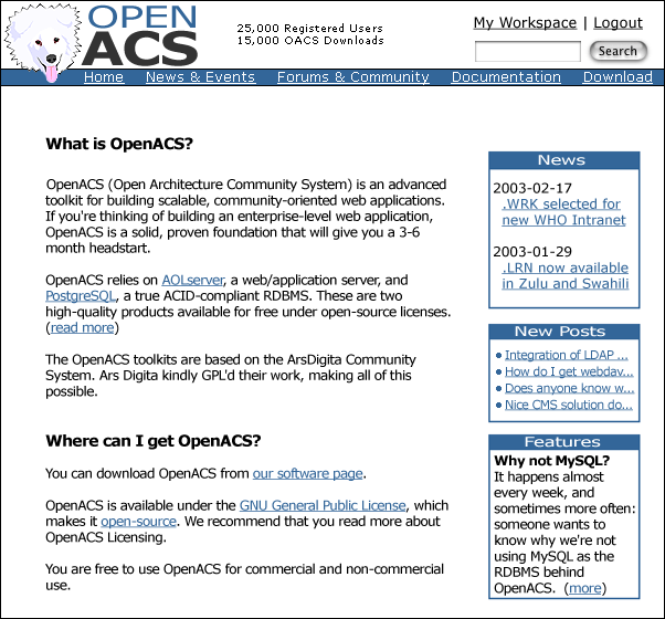
First, I would like to address Alex. I really like our mascot the way he is... I do not feel we can change the way he looks at this point. That dog has staying power. Those fur spikes, playful look, and tongue are part of his personality and have become symbolic for OpenACS. It would be a major mistake to make any changes to that fur ball (especially now).
Next, here is the first iteration of this proposal (46K gif):
Finally, some background information:
- I think it is important that the banner area be as small as possible and be served with every page. I know a few in this thread have mentioned that they do not like the idea of having a toolbar... yet I feel that the option to jump to any of the main branches of the site any time is important. I tried to reduce the space the banner and toolbar takes up to a minimum (content should be the emphasis on this site). If needed I think I could squeeze it all together a little more. Alex sticking his head out over the toolbar saves more space and gives the feeling that a powerful dog is in the woodwork interested in what you are going to do with this powerful toolkit.
- I reduced the login/logout space to the words themselves, which would require a separate login page (I felt the login area being on this page would take up too much valuable space). Being in the corner of the screen gives the login/logout a lot of weight. I also moved the search form and Workspace link up top to save space. Workspace and search should also always be in the same spot at all times (another reason to keep them up in the corner)
- I changed the blue -> #336699. One of the original complaints when the logo was introduced was the light blue color of the word "OPEN" (for a couple of good reasons - legibility being one of them). I too have problems with that color blue since I first saw "Open" in the logo (my main problem with it is pure contempt of that shade of blue, which to be honest is one of the main motivations behind this exercise ;). I went for a deeper blue and changed the text in the toolbars to white (white on blue has VERY high legibility)
- The content area should be independent of any tables related to design that might steal space. When on the net I want to use all of my monitor to look at documents, forums, and other content (which reminds me: I would love to see some more randomly beautiful pictures on our site. I know of one or two that where pulled into the whole ACS thing as a result photo.net and photography. Don, when are we going to get to see some random birds of prey here on openacs.org?).
- The minor design change I propose would be very easy to add to every page (now). It would also fit very well into the new version of the site with little if any changes to individual pages (I started this design today based on the working prototype up at openacs.museatech.net). If this design gets picked it should be easy to get it into adp within a couple of hours so that we can make the August 13th deadline (obviously I would be willing to help ;-).
The content in the proposal is just filler and the different blocks can be moved around at will (although we must leave space for the trail of breadcrumbs... I left space for them here). Which reminds me: someone should think about the Home/Your Workspace usability problem in the breadcrumbs... the way the site is set up now sometimes "Your Workspace" appears as the root of the site and sometimes it doesn't. Keeping the "Your Workspace" as a standard part of the header and removing it from the breadcrumbs might be one solution, but this is probably not the time to talk about this problem.
Looking forward to feedback.
~CRB