Forum OpenACS Q&A: openacs.org designs... opinion please

Collapse
Posted by Jun Yamog on
Hi,

Infiniteinfo has made 2 designs for the upcoming openacs.org site. Thanks for Rob Locke for allowing our artists Rene and Mikko to give some hours for the design.

You can see the design by following the link. Each image is about 200-300k.

design 1
design 2

I have chatted with Dave B, Ola and Talli on the IRC channel and we think it would nice to get a feedback from the community.

Although we can't 100% make sure that the designs will make it on the launch of the new openacs.org we will try our best to put it in. We also can't commit that our artists will do a redesign based from feedback since we are a bit loaded.

Anyway our main concern right now which one would you like better design1 or design2?

Collapse
Posted by Jun Yamog on
I like design2 better.

It has more life, simple, and I think it would last longer.

Vote +1 for design2

Collapse
Posted by Caroline Meeks on
We just went through this process for SloanSpace so I'm all primed for graphic speak and on giving specific feedback.

I like the logo and download button from 2.  It looks alive and speaks of a vibrant community. The colors hold your interest and Alex is cute.

I like the search box and login box placement on 1. Login box is too prominent on 2.

I'd like to see more of the whimsical use of color that is in the download button used on 2.  For instance think more could be done with the login and search buttons to compliment the colorfull alive theme.

Not thrilled by the menu bar on the top on either of them.  Again I think more of the life and color that we see in the download button could be applied here. I generally don't like all capitals and I don't think the caps work well in the menu bar.  Capitals are harder to read and the menu across the top is actually where you want the quickest recognition.

Overall, they are both looking very good! Great start!

Collapse
Posted by Ola Hansson on
Jun, you don't realize what you got yourself into...😉

I think both designs are nice. If I had to choose between theese two alone, I would lean towards #1. It is awesome even though the dog looks like a devil...

But let's not count the current design out yet. After all it's not bad at all (IMHO). A lot of work has already been invested in that design.

I can't imagine any designs beside the current (i.e., the one kindly contributed by Museatech) will make it in before August 12, anyway, but I don't know how much time the others have...

Collapse
Posted by David Siktberg on
Register another design 2 vote for its vibrance.  Minor observations:  the middle column feels very crowded by the two edge columns, and the visual balance of the top border seems off - login too prominent, logo perhaps too big.  Very good start -- thanks for the great creative effort!!
Collapse
Posted by Jun Yamog on

I apologize for not having the existing and WORKING design posted. You can access it at Existing and Working Design

I believe the effort maybe late and the most likely scenario is that the existing design will be used for launch. That is why there is no commitment on it. But atleast we can start somewhere, or maybe just say that the existing is better than the 2 proposed designs.

Collapse
Posted by Dan Wickstrom on
Except for the devil-dog, I like design #1.  If I had to pick, I would pick #2 over #1, because of the dog logo.
Collapse
Posted by David Kuczek on
Overall, I like #1 best. The Logo from #2 is better though... Don't really know about the top navigation on #1...
Collapse
Posted by Don Baccus on
I think launching with the current design is best due to time constraints ... but if there were time to incorporate the curvy panels from your design #1 I'd go for that over the 3D shaded panels in the existing design.  Perhaps I'm biased from staring at the greenpeace curvy panels for three months while contracting with them, though.

What do folks think about that?  I think the curved borders are just more aesthetically pleasing while adding a bit to the whitespace that separates elements.

The logo from #1 - no way, sorry! :)  In fact I don't care much for that top bar at all.

I kind of like Alex peeking out from the Big O in #2 but I also have no problem with our current logo.

It's great to see folks putting forward ideas for design!

Collapse
Posted by Stephen . on
I like design one alot, even though alex looks more like a siberian husky than a samoyed.  I find the perky blue of design two annoying, and combined with the cutesy dog logo with pink tongue it looks like a 9 year olds sleep over (as does the current design).

How about taking Alex out of the logo altogether?  To preserve the heritage-of-the-dog, he could become a site spokesdog, a cross between Clippy the annoying paperclip and Where's Waldo. Photo of Alex with speech bubble attached: "I find the fine grained permissions model of OpenACS invaluable in my consulting...".  'Funny' (ahem..) not cutesy.

Collapse
Posted by David Kuczek on
An old German proverb says: "You can't argue about taste" and that's our problem...

It kinda looks like I am coordinating the redesign effort for our new oacs site. Roberto and Dave (sorry if I forgot anybody) are pushing the programming part of our relaunch to meet the August 13th deadline (Linux World - August 13-15 in San Francisco, California), which is great!

The questions are:

1.) Do we want to have a new desing until August 13th implemented?

2.) If yes, I would suggest that we decide on the logo and the general page design seperately via a poll. I don't know if anybody else is working on design suggestions, but until today we have three general site design suggestions and three logo suggestions (the old one and the two from Infiniteinfo)...

If somebody else wants to bring in either a logo or a general site suggestion, I would suggest to set up a deadline for Friday, August 2nd... We could set up the poll over the next weekend and let it bleed until Tuesday August 6th. This way, we would have one week to implement the layout... Does this sound reasonable?

Collapse
Posted by Jun Yamog on
Hi David,

With my chat with Dave and Talli we should NOT wait for the proposed design.  Dave and the others should continue as the planned course.  This design may or may not make in during the launch.

As for voting I am ok with it.

To All,

This are proposed design by our artists.  If they are decided to be better than the current design then someone has to convert it into adp and change the all other adp stuff in the current design.  I can't commit yet to making it into adp should it be decided.  But maybe I will, any other volunteers?  Current volunteers in openacs.org site should not volunteer since I know there plates are full.

Our artists may not be able to donate additional hours so maybe the likely scenario is to take the comments here straight into adp.  These designs are late for the party but maybe it might make it... maybe not.

Collapse
Posted by Don Baccus on
<blockquote><i>How about taking Alex out of the logo altogether?</i></blockquote>
Because when we've had such discussions in the past it's become clear that lots of people LIKE having Alex in the logo.
<p>It certainly looks no more "childish" than the penguins we see all over the place ...
Collapse
Posted by Andrei Popov on
I'd say "working" site is good as it is -- maybe a few (**few**) designer touches here and there could help, but otherwise it is light and clean, unlike design1 with all the pixel bloat.

Design2 would be ok, but the top portion needs to be redone -- it is to heavy, this blue/cyan field seems a bit out of place with the rest of the page.  Login box is too dominant too.  Also, I like Alex as he is on the current logo -- softenning him like that -- he almost looks like a pooddle...  Then again -- tastes differ...

Collapse
Posted by Malte Sussdorff on
Thanks Rene and Mikko for those nice designs. Personally I'd vote for #1 as I like smooth and round edges. Blue as the main color speaks of stability and reliability. And I like the dog better, but that's probably because I like Huskies more than Samoyeds if it comes down to facial looks. But we might think about having a two color dog logo so people could add it to their own site as well (as it is easier to include, especially if you can vary the colours). Who'd do the port to .adp pages and templates?
Collapse
Posted by defunct defunct on
Design 1.... no doubt about it..
Collapse
Posted by Jade Rubick on
We really should be using the poll module for this.

I vote for design #2, minus the cyan-like color at the top. I also
like the original design, and would be happy with that with some
minor tweaking.

Collapse
Posted by Cathy Sarisky on
I'd like to second the "two-color dog logo" idea.  :)
Collapse
Posted by Christian Eva on
De Gustibus ...
I certainly like design 2 much better, maybe with some minor enhancements (could be over time) like the details/colours in the download button. A palette of fresh, well balanced coulours will invite much more than the "Plastic outlook" of desing 1. Design 1 looks very (sorry) "American" - also much more like fashionable game-look and it is because of that not so appropriate (nothing against the quality and the artwork of the design - on the first look I thought it looks brilliant - but on the second look I would prefer to come back to a design-2 based site).

What Alex concerns I just think that he is definitively a "member of the family" and reminds us of the brilliant impuls of Philip as well as of the downfall of the "over commercialised AD". Looking out of the O he is there right in the middle - I like it.
So I'd like to see this clear and light face as our entrance and then some of the more fancy layouts in some Demo-Screenshots easy accessible from the homepage.

I also would like to thank the whole community at this place for the ongoing enthusiasm and now for the fresh wind coming up over those last weeks!
Christian Eva

I found this thread yesterday and I have been looking at the two designs and I would like to make an additional independent design proposal (rather than complain I took some time to make a concrete suggestion). I really like the minimal design that we now have and I would rather see a gradual change in design that addresses some of the problems with the present site. It would like a design that gets out of the way once you have made friends with it and I would rather see energy being put into making openacs.org usable (and getting all the modules up and running that we have inherited from aD).

First, I would like to address Alex. I really like our mascot the way he is... I do not feel we can change the way he looks at this point. That dog has staying power. Those fur spikes, playful look, and tongue are part of his personality and have become symbolic for OpenACS. It would be a major mistake to make any changes to that fur ball (especially now).

Next, here is the first iteration of this proposal (46K gif):

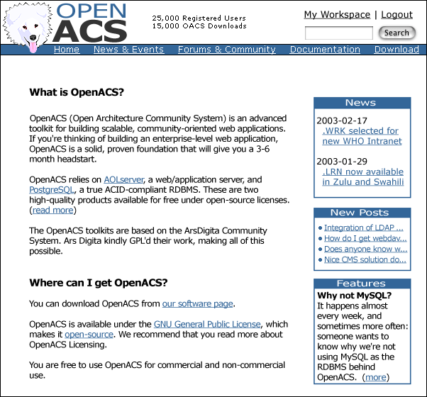
Finally, some background information:

  1. I think it is important that the banner area be as small as possible and be served with every page. I know a few in this thread have mentioned that they do not like the idea of having a toolbar... yet I feel that the option to jump to any of the main branches of the site any time is important. I tried to reduce the space the banner and toolbar takes up to a minimum (content should be the emphasis on this site). If needed I think I could squeeze it all together a little more. Alex sticking his head out over the toolbar saves more space and gives the feeling that a powerful dog is in the woodwork interested in what you are going to do with this powerful toolkit.
  2. I reduced the login/logout space to the words themselves, which would require a separate login page (I felt the login area being on this page would take up too much valuable space). Being in the corner of the screen gives the login/logout a lot of weight. I also moved the search form and Workspace link up top to save space. Workspace and search should also always be in the same spot at all times (another reason to keep them up in the corner)
  3. I changed the blue -> #336699. One of the original complaints when the logo was introduced was the light blue color of the word "OPEN" (for a couple of good reasons - legibility being one of them). I too have problems with that color blue since I first saw "Open" in the logo (my main problem with it is pure contempt of that shade of blue, which to be honest is one of the main motivations behind this exercise ;). I went for a deeper blue and changed the text in the toolbars to white (white on blue has VERY high legibility)
  4. The content area should be independent of any tables related to design that might steal space. When on the net I want to use all of my monitor to look at documents, forums, and other content (which reminds me: I would love to see some more randomly beautiful pictures on our site. I know of one or two that where pulled into the whole ACS thing as a result photo.net and photography. Don, when are we going to get to see some random birds of prey here on openacs.org?).
  5. The minor design change I propose would be very easy to add to every page (now). It would also fit very well into the new version of the site with little if any changes to individual pages (I started this design today based on the working prototype up at openacs.museatech.net). If this design gets picked it should be easy to get it into adp within a couple of hours so that we can make the August 13th deadline (obviously I would be willing to help 😉.

The content in the proposal is just filler and the different blocks can be moved around at will (although we must leave space for the trail of breadcrumbs... I left space for them here). Which reminds me: someone should think about the Home/Your Workspace usability problem in the breadcrumbs... the way the site is set up now sometimes "Your Workspace" appears as the root of the site and sometimes it doesn't. Keeping the "Your Workspace" as a standard part of the header and removing it from the breadcrumbs might be one solution, but this is probably not the time to talk about this problem.

Looking forward to feedback.

~CRB

Collapse
Posted by Don Baccus on
I agree with most of what Carl's saying, actually, especially about Alex the Doggy :)
<p>
Simon and I had a brief chat about cultural differences on IRC and I think that's something that's going to be difficult to bridge.  The Doggy plays well with Yanks, it seems (Carl's a Yank even though he's a medical student at U Heidelberg).  Having done business in the UK for about 12 years and suspecting that not much has changed in the decade since I did that, I can understand where Simon is coming from.
<p>The professional software world UK is a bit more uptight and stodgy than in the US, that's just a fact.
<p>
But I still like the Doggy.  It's time for the Brits to learn to loosen up :)
<p>
I like the idea of a clean, sparse banner and a toolbar.  In general I personally like Carl's banner design a lot.  It seems very clean and sparse to me and for those of you who've looked at much of my wildlife photography and maybe even my code you'll understand that I try, at least, to be consistent in this preference.
<p>I still like rounded corners ("curvy boxes") on table headers as I personally think it tends to emphasize the whitespace separating table boxes.  And I like whitespace separation.  I think one can cheat a bit and cram one's tables together slightly while still having the effect of separation with rounded corners.  I personally didn't find the contrast between the color chosen for the header type in Jun's design #1 sufficient and the gray too dark in the box, as well.  I'm using a ViewSonic flatscreen so YMMV if you're using a CRT.
Collapse
Posted by Dave Bauer on
I like Carl's design ideas also. Very clean, and simple. I have been using similar minimal designs myself lately.
Collapse
Posted by Carl Robert Blesius on

Here's a "curvy box" version for Don (spacing between the tables is the same):

Collapse
Posted by Don Baccus on
Nice ... now I think you could poach some whitespace between the boxes and still leave a good visual impression of spacing.  Helping be miserly with screenspace.
<p>Though the whitespace you're leaving looks very nice.
Collapse
Posted by Don Baccus on
And also "curvy boxes" just look less formal to me than straight-edged boxes ... I like the informal-yet-clean design expressed here, though as mentioned above those from other cultures may not see the "yet clean" (implies professional) aspect ...
<p>
This is turning out to be, in part, an interesting exercise in understanding how different folks from different parts of the world see things.  I'm exposed to this due to my involvement in photography but it's interesting to see it in this context ...
Collapse
Posted by Don Baccus on
I especially like the "25,000 registered users; 15,000 downloads" part of Carl's design ... with the ".WRK" coming in a close second :)
Collapse
Posted by Talli Somekh on
I really prefer Carl's work as well. I think that they are professional yet focused and befit a developer website.

The only issue I have, and this is with all the designs, is that the color schemes are almost identical to our competition. Check out http://www.zope.org and http://www.phpgroupware.org.

I guess there's nothing really wrong with that, but I wonder if there's some link between the fetishes for open source collaborative software and different shades of blue.

Something to consider for those psychologists out there.

talli "my fetish is freudian" somekh

Collapse
Posted by Marc Spitzer on
The new curved box looks very nice, dam good job.  Thanks for doing it.
Collapse
Posted by Jun Yamog on
I think Carl's work is great.  I have showed it to our artist as well, this is a good additional input.

On the IRC about 12 hours ago the discussion is that Infiniteinfo will try to revise design 1.  We won't do any further revision in design 2... no more resources.

Mikko (our artists that made design 1) will make the logo look more like Alex,  revise the header, add more color (Talli's suggestion), etc.

Take note that all proposed design must not intefere with DavB, Ola and Roberto's work.  The site has a working design care of Musea and will use that in the launch if none of the proposed design makes it.

I am glad that people are pitching in, like Carl.  If there are creative people out there please pitch in.  Hopefully in the end we will have a good design that will make most people happy.

Collapse
Posted by David Kuczek on
Talli,

there is a reason why most of the sites are blue... I read a study on Levi's jeans and a psychologist said that around 80 percent of males name some shades of blue as their favorite color! Females are much less streamlined I guess 😉

On the other hand there are many pleasent things that people associate with blue, like sky, sea etc.

Collapse
31: Just one teensy quibble (response to 1)
Posted by Paul Sharples on
I, too, like Carl's designs, but I have slight doubts about the style of the "Search" button. Basically, with buttons disguised as images, I never know whether the site designer expects me to initiate the search by clicking the image or hitting return. So I'll hit return, then click the button if nothing happens.

I know it ain't pretty, but I prefer to see web form buttons in the default style -- it's just so much more consistent with the rest of the web look and feel (ditto for blue underlined hyperlinks). These default buttons also have the nice property that they highlight when the user tabs onto them.

As a final comment, the translucent pill style feels like a "me-too" homage to Apple's Aqua.

To me, the overall page looks nice and "lightweight": not too much noise, nice whitespace, and it should feel snappy as well. At this point I should confess that I almost never visit the OpenACS.org homepage because it's just too static. And the font's too big so the information density is lower than I like. Any of the designs shown in this thread will be just fine if these more fundamental flaws are corrected.

Collapse
Posted by Lars Pind on
My vote also goes to Carl's design so far. One comment:

I like Jun's designers' idea of a big, graphical "Download OpenACS" link.

I'd like to add a similar "Try OpenACS" link to a running demo site, where people can immediately jump in and play with it.

/Lars

(Paul, I think this is because Carl's working on a Mac. This is what buttons look like on a Mac.)

Collapse
Posted by Jun Yamog on
Hi,
<p>
Ok Mikko has given another design for us.  I do think that the dog is very good on this one.  This actually based from the current logo and Alex's pictures.  He has also made the top header cleaner and more simple.  He has also taken Talli's suggestion of adding another color aside from blue.
<p>
<a href="http://www.infiniteinfo.com/openacs/mainstudy03a.jpg">design 3 with login box</a>
<br>
<a href="http://www.infiniteinfo.com/openacs/mainstudy03b.jpg">design 3 without login box</a>
<p>
In case anybody is interested with the PSD you are free to download it here
<a href="http://www.infiniteinfo.com/openacs/mainstudy03a.psd">design 3 with login box (PSD)</a>
<br>
<a href="http://www.infiniteinfo.com/openacs/mainstudy03b.psd">design 3 without login box (PSD)</a>
<p>
I hope design 3 will make a lot of people happy.  I sure does make me vote for it.  At any rate I would like to thank Mikko for the great work.
Collapse
Posted by defunct defunct on
Hmm.. I quite like Carls design, but I can't help feeling its not much of a step forward. Although simple and clean, its barely discernable from the original.

And on the subject of dogs, I guess yes we English are a little more 'conservative' but don't misunderstand. I don't mind the dog, its just the original logo was a little bit 'Hello Kitty -ish'... I think its worth finding a derivative of the original logo that is more universally appealing....

The other comment that keep popping up is 'its looks great for a developer site'.

Whilst I accept that is true, I'm not prepared to accept that OpenACS is merely a melting pot for enthusiastic developers. I think we should accept that the community is more than just a development one (significant portion though that is), and the design should reflect that to some degree..

My thinking here is (and I just *know* this is going to cause waves) that in particular the main areas of the site are possibly more important to non-developers than developers. After all, if your an OACS developer, chances are you aren't paying much attention to thedesign after a while anyway. However the more commercially or speculatively visting folks are likely to place more emphasis on it.

I realise everyone can throw the 'simple is best, its what Philip prescribed, techies know better' and all that.... but human nature is what it is, and giving off a more 'professional' or 'slick' look is part an parcel of appealing to that. The website is probably the most visible and significant marketing tool the community has, so please forgive my cautious approach. Without wishing to be unkind, what I definately don't want to see is a 'site for geeks' style approach, it alienates non-techies, and also gives off a sort of inverted snobbery.. i.e. 'we wouldn't lower ourselves to do something a bit marketing-oriented..and this site is too techie for you...'
. Hope that makes sense.
I still think Design #1 was the nearest, and if the header bar was just shrunk a little, it'd probably fit quite sweetly..

Cheers

Simon

Collapse
Posted by Lars Pind on
Simon,

I agree with your point that us community regulars don't pay much attention to the site. I hardly ever look at the front page, I just stay in touch via email notifications, and then click through to the bboard pages. So perhaps I'm not a primary target here. A very valid point indeed.

I also think Design #1 has appeal, though I would like to see the top bar not just shrunk a bit, but also the number of overlaid different forms of shapes toned down a bit. To me it comes off as a bit amateurish, a little too heavy on the "Look, Ma!".

My ideals have always been Amazon, Expedia, Yahoo.

/Lars

Collapse
Posted by defunct defunct on
I like the addition of yellow Jun.... (still fancied orange myself).. Also like the logo more... cute, but not cutesy....

Nice one ;)!

Collapse
Posted by Jun Yamog on
I think Design 3 is a good compromise of both.  Not too techy not too marketing.  I am really pushing for design 3 since Mikko has put a lot of effort on this.  We also keep on discussing on what to change and what to dump out.

Also take note our artists like Mikko and Rene are very good in making web sites.  So I trust them on what they make.  I am a programmer so I have a less respectable opinion when it comes to design.

Collapse
Posted by Don Baccus on
Design #3 is good, too.  I could live with that or with Carl's last effort.
Collapse
Posted by Tilmann Singer on
If there was a poll I'd vote for Carls first suggestion. For some reason it just seems most "OpenACS"-ish to me - it's clear and simple, and somehow harmonizes with the philosophy of OpenACS, although I am afraid I cannot explain why. Maybe it's just because it takes much of the existing design, which I actually like and would find it nice if some pieces of it could be kept. The other designs, although all very  beautiful, look very generic to me, e.g. they could as well be for any commercial product (I immediately associated icecream with #1 and #3 😉

Some random comments:

I agree with Carl that it'd be nice to have the top bar served on every page, above the page title and the breadcrumbs, although I find that the one in his suggestion would still be a bit too tall, so I'd vote for the suggested one on the homepage and for a smaller one that appears on the content pages. The latter one could also be made to nicely integrate the title, breadcrumbs and horizontal line that all pages currently have.

Correcting the case in the logo, so that it says OpenACS instead of OPENACS would be cool (has been said here before I think).

I don't think that a prominently featured download button is a good thing. OpenACS is not something that can be downloaded and immediately installed easily - if you give newbies that impression by advertising a quick download it will only create frustration. Having links to demo or production sites on the other hand would be a great way to show off what can be done with the toolkit, and people whose appetite is wetted  will more likely accept a longer installation procedure (and find the download on openacs.org, even if they have to click on "software" before or type in "download" into the search box).

And finally a question that I think has been asked here before but not answered yet: are the current design suggestions based on a fixed width? (I hope not)

Collapse
Posted by Talli Somekh on
I agree with Don, Design 3 or Carl's stuff.

talli

Collapse
Posted by Walter McGinnis on
I think Carl's stuff  is nice and clean, but it a little too familiar.
Reminds me a lot of arsdigita.com at a certain point in its
history.

For what is worth (as a yank) I would vote to drop Alex from the
logo.  He doesn't really symbolize what OpenACS is to me.  On a
bad day I might summarize Alex as "fluffy and kinda dumb"; on a
good day "fluffy and happy".  Oh well, guess I should move to
England.

My vote is for 3, but I would like to see the top bar take up less
vertical space.

Thank you Mikko, Jun, Rene, and Carl.  Its great to see some
definite design improvements.

One last thing, can we get a flash version of the front page?

Haha.

Collapse
Posted by Jun Yamog on
Hi,

With much discussion on IRC we have agreed to go with design #3.  The aim of design #3 is to keep non technical people and technical people happy or just acceptable.  And it seem to have achieved its aim.

Here are the facts:

1. We have a working design for the launch and the priority is still the site up and running and not the design.

2. There is no big objections on design #3 from both ends of the spectrum (marketing and techy people).  All seems to boil into personal preferance.

3. We will take into the account of the revisions... but that will be made on the adp it self.  Like Til's suggestion of removing the download link.  A couple of people like to toy around to reduce the yellow bar.

4. We are looking for volunteers to get the design into adp.  I might do it but I still have to check... no commitments.

5. We are still happy to get new designs but it must be in adp form already.

6. Sorry for not offering any poll... I just want to get this moving.  Anyway if anybody objects just go for #5.

The end result hopefully will produce a site that will make us happy if not acceptable to us.  Lets move on forward.

Collapse
Posted by Peter Marklund on
There are a lot of good designs here! I also liked Carls design but I am happy with the desicion to go with design #3 since I think it will have broader appeal.

It would be cool if we could make the body of our homepage dynamic. Currently the body is really an about OpenACS text. I think this about text is good. However, I believe that only the first paragraph of this text (followed by a read-more link) should be retained on the homepage. The paragraph would serve first time visitors who need a general orientation of what OpenACS is. The bulk of the page would have up-to-date information that is interesting for returning visitors. Giving plenty of space to new postings and articles etc. also appeals to first time visitors since it shows that the community is active.

Good candidates for very prominent static links are a demo system link, a download link, and a case-studies link.

Collapse
Posted by Tapiwa Sibanda on
Good candidates for very prominent static links are a demo system link, a download link, and a case-studies link.

I agree with Peter on this one! Every time I check out a new toolkit, especially the *CMS* systems out there, I look at

  • does the site make good use of it's own toolkit?
    • is the site pleasing to the eye?
    • is it useable?
  • are there any other sites out there that have made good use of the app?
    • do they look substantially different (aka if I see another phpnuke or postnuk site I will go ape-s*it)
  • is there a demo I can play with and get a feel for the toolkit?

one more thing.... please no flash on the homepage. I think the only time flash should be used is on a frontpage for a graphic designer's portfolio sites. Flash tends to detract from the substance of the site.

Collapse
Posted by Carl Robert Blesius on
Jun, I was very surprised by your comment (I have not been on the openacs IRC much, yet from experience I know it is hard to have focused discussion using group chats). So I went looking for logs of the aforementioned discussion. To my surprise I found that a very small number of people took part and I could not find any concrete agreement.

This is why I would like to continue the discussion and see a poll.

I have taken comments above an tried to integrate them into the design.
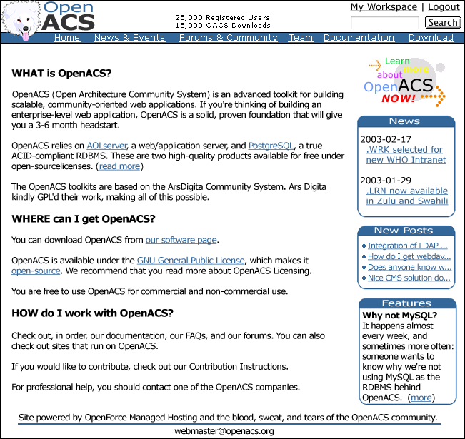
Some comments:

  • Reduced the size of the top banner (although the start page banner might be a little bigger, which might allow the login dialog to appear up top)
  • Changed the search button to the Microsoft version (Lars was right, I use an Apple and that search button is the result of a screen shot. In other words: it was not a "me-too" homage, but the real thing 😉
  • I liked the colorful download link in the first design, which is why I decided to integrate it into this one, yet I agree with Tilmann and Lars: it would be better to link to a demo site (the OACS installation is quite an act and probably not a factor we want to use as a marketing tool). I can easily change that to "Try OpenACS NOW!".
  • Fixed the case in the logo... it now reads OpenACS instead of OPENACS
  • Used more of the available whitespace. Also: the design will not be of fixed width (although I started it with the small screens in mind). The content density should be determined by the users browser settings (I want to keep the site as accessible as possible), but it should be easy to make the default size smaller.
  • I also want sub-second response times. I want the pages to load quickly (which is why I think I can implement this design with less than 10K). On the web the time factor makes the design an engineering problem.

I also quickly put together a dummy content page (could be linked from the "Learn more about OpenACS" button) with a diagram that I am working on:

The graphic's colors should give a Lego like impression (that is the feeling I get from the toolkit). That button also played a role in the color choice. Although this can be easily changed (It would probably be better to go with pastels that get out of the way of the content).

Unlike dotLRN which uses the Legos to create a complete packaged application, OACS in its present form is something that developers can use to tackle problems. I think we have to keep this in mind, that this IS a developer site. I want developers to find things on this site... and find them quickly. Obviously we need to make the site look good and create a space for decision makers (with some diagrams and case studies) as well as other members of a growing community, but isn't this what the subsite package is for? This site is about a toolkit and it needs to cater to the people that are willing to roll up their sleeves a make cool things.

Collapse
Posted by Christian Eva on
Thanks Carl

I agree with you, that went suddently a bit too fast. Your design looks now very, very good.

I also like some sort of a poll, maybe on a separate thread just for 3 days ...

Collapse
Posted by defunct defunct on
Carl,

If nothing else I think there has been general agreement that the site design should be a happy balance between development and other areas, that why design #2 (now #3) was carried forward.

It is not just a developer site, and I don't think there's any general feeling that it should be..

Relegating other activities to a subsite is not the solution. That may be where the content is, but we still need a 'common' design.

Much as I like your design, there seems to be some agreement that design #2(3) is the better start point and I beleive Jun is progressing from that basis. I don't think its worthwhile at this stage, dropping it and going back to the start again.

Surely some of the design comments/touches you've suggested could be incorporated into that...? This would be far more productive, constructive and thus keep things moving forward.

And, as I posted a little while ago, your design at present is barely much different from what we already have.

Simon

Collapse
Posted by defunct defunct on
Actually Carl, just reading your post again, I'm very unhappy with the comment..

"This site is about a toolkit and it needs to cater to the people that are willing to roll up their sleeves a make cool things. "

That may be your persecptive, but it is certainly not everyones. Just because people are working on things other than the code, does not make what they do less significant.

The site should cater (as far as possible) to everyone who uses/benefits and contributes to the project.. not just techs...

I may be misreading but you comment sort of reads like

" this site is for tech-hobbiests who want to play with the toolkit'...

Given that its quite often commercial activities that help feed into the toolkit, I don;t see how such a staement stands up.

Collapse
49: No Poll Please! (response to 1)
Posted by defunct defunct on
(I must try and get everything in one post ;)

I would also like to strongly urge us to avoid a poll to decide the design....

Nice idea though it is, using a vote does assume a reasonable distribution of types of members.... Design by committee *never* (absolutely never) works... lets just debate and leave it to the gatekeepers to make the final decision...

Collapse
Posted by Talli Somekh on
Sorry Simon, that's bullshit. You've been pushing really hard for a more marketing driven website for the openacs community, but you haven't respected that not everyone feels that way.

Many many people in this community do not want a website that is graphic oriented. Many of these people are contributing money and work to this community and have at least as much voice as you do.

Carl has contributed work, and it's very good. Quite a few people in the community have said that. I do believe that a poll is in order. That would be a fair and respectful way to Jun and InfiniteInfo, Carl and the people in the community.

talli

Collapse
Posted by Jun Yamog on
Hi,

I apologize if it went faster than other people expected. I just want this to move forward. I think we can still go for other design but it must be now in adp for openacs.org-dev. That way we really move on.

Also design #3 is something that strikes the balance between tech and non tech. Please understand that OpenACS need non-techs too in order to survive. I am a techy too but I know tech will not survive alone.

I don't aim design #3 to have everybody happy, but atleast it acceptable to a good range of people types. Don't you think design #3 is acceptable to you? Is it so ugly and unaccepetable?

Also I have taken things into account like reducing the header more... correcting the case of OPEN ACS... download link... experiment on the hue of the yellow.... page width.... I can't have our artists keep on revising his design until everybody is happy. He is very busy in fact right now he stayed until 12:30 am in the morning.

I think the page load of design #3 is not going to be slow. We have designed sites that are fast loading with good design. I can show you a big list of sites.

We can always alter the design.... this is design anyway it wont hurt any data. As DavB and the others said we can tweak the design on the adp.

You can also take note that each of our design's download link is different. Because the artists knows that it has to conform to the design. You may also notice that each Alex logo is different its because it has to be with the overall design.

Can we move on forward? Can we now get volunteers to make it into adp? I have now cvs updated my tree and restored the database of the new openacs.org just to see if I have some time to make the design to adp. I will be happy if somebody just voluntereed to make into adp. If he/she really can't accept design #3 I will be more than happy to get his/her designs in adps.

Lets try to move forward... and also think not all OpenACS existing and MORE ESPECIALLY NEW users will be developers. Isn't that the point why DonB and others is looking to put up new forums for designers?

Collapse
Posted by defunct defunct on
I've been pushing for a more 'balanced' website that reflects more than *just* the developer community.

I would argue that the balance at present is wrong.

No one is talking about graphic-oriented... graphics has little to do with it, its just a question of presenting the community as the summation of its parts.

I would also like to point out that there are also many people who;ve like jun's design #2...

My objection to a poll is not that I don't beleive in democracy, but I don't beleive in 'populist democracy'..

As this community grows it is acquiring more and more members who have diverse (and not just tech related) interests.. we need to attract more of them and we also need to retain them....

But these are old arguments, and to be honest I think you understand my position quite well as we've discussed this before,

But what is really puzzling me is why, when a few people have suggested a more 'all-encompassing' look and feel, this has met with such objection.. after all, the regular tech guys here are hardly ever likely to pay much attention to the 'design' in their day-to-day usage of the site.. its the more casual, passing users it needs to attract.

Just because the site might end up looking a little more comercially savvy is not an inherent evil... after all if my company didn't make money I;d have no time to contribute...

Let me be brutally honest.. and I apologise as I'm not normally one for harsh tones or flaming but....

There is a distinct 'anti-corporate' sort of feeling within this community and my suspicions are that this debate has more to do with that than it does good design...

But, the reality is that this toolkit *is* now part of the commercial environment, and it needs to appreciate that.

Otherwise the alternative is that you drive away the kind of commercial interest that can help the toolkit grow.

Apologies for any offence...

Oh... I don't think peoples opinions necessarily need labelling as 'bullshit' ;)

Collapse
Posted by defunct defunct on
Oops... Jun got in there first and said it better than I did..
Collapse
Posted by Talli Somekh on
I don't have issues with whether the site is corporate or not, but I do have issues trying to marginalize Carl and his work.

There's *no* reason to not take a poll, except if there isn't interest in seeing what people prefer. We're *not* limited by time, since the next design isn't goign to be part of the first launch.

Carl and Jun have done good work. They both deserve having a fair chance.

talli

Collapse
Posted by Jun Yamog on
Honestly I just wish things are not turning out to this way.  Its damn disappointing to be at this point and to need a poll.  I think its better to discuss the points rather than clicking that vote botton.  I wish it was not this design againts this design... I cerntainly hoped that it was... maybe we can change this... and that... working together.

I will just go home and sleep... very frustrating.  Maybe I will try to find time tomorrow with a clear head and get something going.

Talli,

Please don't put me or Infiniteinfo on the other side of Carl and community.  I certainly don't want anything negative for the community.

Collapse
Posted by Tilmann Singer on
I highly appreciate the generous donation of precious graphic designers work that infiniteinfo has put into this so far, as well as everybody else's effort. I think the current proposals are already much slicker than what comparable projects are using in their web presentations, but the existance of some high quality proposals should not stop us from having a thourough debate over the matter.

The question how the website looks like is critical for the project and does not lend itself to a "let's move forward as quick as possible" approach, IMHO. Especially since it is clear that it is not necessary to come up with a new design before the new 4.x site can launch.

I am a bit concerned about the way in that Carl's contribution was ignored previously by proclaiming that there was already an agreement on #3, which in my opinion is not the fact just because a few people on IRC who happen to be there on the same time agree on it and because it gets repeated on the bboard by the same persons over and over.

On the topic of targeted visitors: although the site may get visited less often by regulars of this community, that does not mean that the site design should not reflect their personal taste, since the site is  there to _represent_ the community to visitors. Just as it's said a picture says more than a thousand words, the graphic design of a website can communicate or lie about the organization that is behind it. The design of openacs.org should thus somehow correlate to the views of the members of the community, and not *only* be targeted at attracting new members. I am not saying that the #3 proposal is not a balance of several interests, just trying to emphasize that the design should also please those of the community who don't actually visit the site often.

Side note: has there been talk on doing a commercially targeted site at openacs.com (I see that Ben Adida owns the domain, so it should be possible)?

Collapse
Posted by Stephen . on
I like Carl's design.  Simple, neat, in the spirit of the ACS.  I still  hate all the Pet Land logos, but I guess Yanks just have no taste...

It's great that there were two people so keen to put effort into the graphic design for our new site, thanks!  They're both looking good at this point, I see no option but to eventually take a poll.

(and take the marketing agenda to another thread...)

Collapse
Posted by Carl Robert Blesius on

Simon,

Here are some responses to your posts:

1. Please do not be surprised that my design is not very different from the present design. Like others in the community, I kind of like the design the way it is (although it obviously has its problems). It is also important to remember that changing the design of the site and the OpenACS Logo are two very different things. Just because a few people do not like the logo now does not mean we can ignore decisions that have been made in the past.

2. I am not going to fight for a poll Simon... I just want the process to be controlled, open, and fair. I do not want a couple of people going off to a corner somewhere to make decisions while the main discussion is taking place somewhere else.

3. Having a poll is not what I would call design by committee. There are a few people making proposals, these proposals are being openly discussed, and comments are being integrated. Placing the completed designs up for a final decision should work (it has worked in the past).

3. At this point I can not classify myself as a developer, I was drawn to the community by what might be one of the biggest projects OpenACS has seen up to this point (dotLRN). I am not interested in making a "tech- hobbiest" site. I would just like to see usability as one of the guiding principles behind the design. The content on the site now is mainly catered to the people that use the toolkit (look at the first paragraph of the index page and the forums). I argue that making the site appealing to a wider audience has more to do with case studies, demos, and content than anything else.

4. Obviously a lot of what the toolkit is has been funded by commercial interests (which is by no means unhealthy), yet OpenACS does have some roots in one of the finest academic institutions in the United States (this should not forgotten). In fact I would be willing to bet you that over the next year the largest contributions to the toolkit will be coming from academic institutions.

5. I would like the design to be less of a factor and the content be main thing that catches my eye. I want to forget about the design. I would really like to see more demos and services offered (wimpy point, uptime, etc.)... these are things that should be emphasized in the new site. Getting people to use the toolkit so they can see what it can do is much more effective than anything else. I would also like to see something like the Ars Digita Systems Journal be revived... a place for developers and non-developers alike to publish things they have created using the toolkit.

6. Finally, I would like to have a fair chance on my getting my proposed design (or lack of design... as you mention above 😉 integrated into the future site.

Carl

P.S. Jun, I by no means want to put you or Infiniteinfo "on the other side of the community", nor am I in a position to do so. I consider this healthy competition (part of this web site design is its users appeal, which is why I disagree with both your and Simon's rejection to a poll). I think the most important thing to realize is that this site is for the community and regardless of the outcome I am sure everyone is happy that something is finally happening in this area.

P.S.S. I like Tilmann's openacs.com suggestion... that is the way Zope has gone (although it will be harder here because there is not a single & quot;com" behind the "openacs")

Collapse
Posted by Talli Somekh on
Thanks Tilman and Carl for saying what I meant much more clearly and reasonably than I could.

talli

Collapse
Posted by Don Baccus on
There is a distinct 'anti-corporate' sort of feeling within this community and my suspicions are that this debate has more to do with that than it does good design...
I'm going to take exception with this comment because I don't think it's true ... most of the folks participating in this thread make at least part of their living off OpenACS, while a few of us make their entire living off OpenACS-related work. Most of the participants are involved with consulting companies each of which have talked about the importance of evangelism/marketing.

One thing that's happening, though, is that the issues of site content and navigation design are getting tossed into this thread, which started as a discussion about a graphic design.

Content and navigation issues can be discussed separately. The balance between marketing-oriented front-page content and developer-oriented front-page content can be discussed later.

As far as our hasty decision to base work on #3, this was in the context of 1) Daveb talking about presenting a modification of the banner for #3 which incorporates some of the simplicity (for lack of a better word) of Carl's banner idea 2) Jun talking about working with the artist to reduce the impact of the big yellow portion of the banner in ways that are somewhat similar to #1. Later Carl talked about adding some of the color elements of #3 to his design (several people commented that they like the thin yellow lines offsetting the blue headers in the table boxes but not the top banner).

So in practice we're talking about a convergence of ideas and two designs.

Jun's talking about getting the designs cast in ADP as a practical matter so we can look towards getting the site built with a new design. InfiniteInfo has talked about doing this piece of work based on #3. We can still fiddle with graphic elements afterwards. Jun's just saying "let's work forward from a design that's already cast into ADPs" not "let's freeze the graphic elements".

There's a difference, folks.

Lastly let's step back and try to keep this from being a "Carl wins" or "InfiniteInfo wins" scenario. As was pointed out above, we're all winning because both designs are better than the current design and both are better than the Musea design. Now I've probably pissed of Musea but the reality is that there wasn't this level of feedbac when they proposed it and if there were, they'd have responded and moved forward, too.

At the end of this I prospose we credit Musea, Infinite Info, and Carl for all having worked hard at graphic design and for all having contributed to the final result.

At some point we need to move forward, folks. Whichever design we pick can be thrown out and replaced later, too, this isn't a lifelong design freeze we're talking about. Let's keep things in perspective!

Collapse
Posted by Talli Somekh on
Don said: "Now I've probably pissed of Musea but the reality is that there wasn't this level of feedbac when they proposed it and if there were, they'd have responded and moved forward, too."

No offense taken, Don.

Although I think it is important that we note and record that Don is being peacemaker here. Has that happened before?

Which raises another item. I've long wanted a page of "Don's Greatest Flames". Maybe with the new site.... :)

I'd be happy to add some from my personal inbox. :)

talli

Collapse
Posted by Jun Yamog on
I am glad that things are toning down.  I have chatted with Talli earlier and I told him that I would not like a poll, but further discussion will be better.

I have also no intention to go into a corner and have the decisions made there.  I have recently discovered that most of the people who do a lot of work for the community hangs out at IRC.  So I thought it was the best place to get opinions and decisions... so I maybe wrong.

Anyway I would like to move things.  Since design #3 was actually based from feedback including Carl's proposed design.  It is not true that its graphics heavy.  Its just because it has a yellow color, thicker OpenACS letters and dog its does not mean it has more graphic elements than Carls.  It has the same graphic elements with Carl's design.

Lets try to decide here in the bboards.  Here are the design elements that is different from Carl's

1. A new dog and OpenACS caption.  We will change the case if needed.

2. Rounded header to be consistent with the rounded boxes to be used on the body

3. Search, login, my workspace is integrated in the header

4. Use of yellow.  Which was suggested by Talli to use another color which turned out to be good in my opinion.

5. Logo, header, boxes and downlink are consistent.

Navigation and content is not an issue because both design will cover the same real estate and both have the same layout.

If we remove all 5 elements we will end up with Carl's design.  Now I would like to get feedback which elements you would like to be removed.  And why?

Maybe people don't like the yellow because it is too foreign... Maybe if it was another shade of blue things would have turned out different.  But I think Talli is right to make the site different from other blue boy site.

Collapse
Posted by Jun Yamog on
Hi,

I hope I get good feedback from my above post.  Also I am looking to make the design to adp myself.  Of course don't expect it but if I do finally make it then great.  I am still looking for a volunteer, I don't have a lot of time in my hands.  But before this happens can we decide on this design issue?

I haven't been vocal with Carl's design since as I have told Talli I don't want to look biased.  I think with the latest design of Carl  does lack the consistency and uniformity.  Carl's design was able to get people's feed back in but it did not take into account that each design element: dog logo, boxes, header, graphic (download link), OpenACS caption, buttons has to blend in together.  I am not a real artist but I have a fair amount of design skills since I did designs when I started to make web sites.

In the medium term if we do apply Design #3 for openacs.org and if people are agreeable to carry it over to the toolkit itself.  aD is very poor in making UI and making them consistent.  The current toolkit has blue boxes for template::blah, each package has its own look and feel.  I think its best to make both the toolkit UI good too and it will better that both site and toolkit has the same look and feel.  So in the medium term we need to decide on the style guide.  How will forms look like, where are navigation elements placed, context bars, openacs.org maybe a good testing ground for this before moving it into the toolkit.

Anyway in the short term I hope the community can decide that design #3 is acceptable.  With the goals of striking a balance between tech and non-tech taste.  And design #3 having all the design elements blend with one another.

Can I now start moving this forward?  Look for a volunteer or do the adp myself.

Collapse
Posted by Malte Sussdorff on
How I'd do things 😊:

I would like to see the login box as a box, instead of part of the header. This way the header would not have to change and I never fancied typing in my login information on the top right. Furthermore we could use this position for banner ideas. This way the status information found in Carls design could be preserved.

Take the new dog. It looks more like Alex. But don't double the O in OpenACS (if you look at the logo, there is already the O around the dog, so no need to double it within OpenACS again).

Use Carls "Learn more about OpenACS". I really like that one, cool work. It is colorful, jumps into the eye, still slick and dynamic. Though our graphic designer is bashing my head for this comment 😊.

Round edges with a second color as a seperator. If we need this for the header as well, hm....

All in all I think Design #3 resembles more of a graphic design attitude with many elements taken from guidelines established over the years.

How to proceed? There needs to be someone to actually do the work. He can and should take a lot of guideance from this thread. But I'd leave the final decision on the differences in design (between Carl and #3) up to the person who is actually doing the work.

Collapse
Posted by Jun Yamog on
Hi Malte,

Thanks for the feedback.

Here are my comments on it.  BTW Mikko will not join this thread so I will give my answer on behalf of him.

1. The login link at the header is basically a link for login (/register).  Its not going to have a email and password.  The login box in mainstudy3a shows only in the home page in case you are not login.  This is a convinience.  We can not have this box all over as other pages will need full width.  So we can only take the top part as the sitewide design.  Much like how stock 4.5 behaves.  We can remove the workspace and login links from the header but that would make the header 3 liner like Carls.  Currently design #3 is 2 liner which makes it having a potential of being actually shorter than Carls.  Its just thicker now due to its a better design aspect to space out things.  But we are going to make it shorter.  So I think having the login and workspace on the header is good it makes the potential for the header to be smaller.  As for the banner we may but that also on the 2nd level header (currently the yellow strip).  But the banner will have to be thin enough in case the user is in 800x600 so all 2nd level navs and search will fit.  Bigger resolutions will have no problem with this.

2. Initially the "0" was the dog initially.  It did not look good.  Trust me we took a look at that option too.  The design took us a whole day debating, there is a of thought that was put into the design.  Of course we will correct the OPENACS case into OpenACS.... it may look better.  We may also experiment on making the "0" less prominent as not to confuse of having 2 "0"s.

3. Carl's "try OpenACS" was taken from our Design 2.  I think we should stick with the design #3 which is integrated to the overall design.  But we will of course change it to Try OpenACS as Til pointed out.

4. I am not sure what you mean about the "round edges of 2nd color".  Can you care to explain it further?

5. Maybe I can still ask Mikko for revisions but I will hold it out until I get substantial inputs.  If not... maybe do it myself.  Any other person there that is good on Photoshop aside from DavB?  If the changes are substantially small then get someone to do the adp is the next step.  We will just adjust from the adp.

Collapse
Posted by Jun Yamog on
Hi,
<p>
I have fired up Photoshop after so many years.  Anyway I have tweaked the design a bit.
<p>
<a href="http://www.infiniteinfo.com/openacs/mainstudy03c.jpg">design 3c</a>
<p>
I have changed the case of OpenACS and blended Open and ACS to adjust to the new case.  Reduced the background of alex and blended the "O" with the header.  That way it would not look to much of an "O".  I have also reduced the size of yellow header but not to much.  Reduced the blue header and increased the sizes of the nav texts.  I may need Mikko to make a good design that is compact we if need to reduce it further.  I don't want to break design and flow of design 3.  I have also changed the "Download" text to "Test Drive"... I need help here can somebody coin a better word?  I need a long word not just "Test".
<p>
I am going to experiment later with the different shades of yellow and possibly shades of different colors.  I am still finding away to get the fonts from the office windows machines since I am here at home now.  If someone know about Photoshop you know why I need those fonts to edit the vector fonts properly.
<p>
So is design 3c a step forward from design 3?
Collapse
Posted by Jun Yamog on
I think I had too much tcl from OACS and Java from CCM... its so much better to do Photoshop.

Here I have 3 tweaks:

Design 3d - PSD source

Design 3e - PSD source

Design 3f - PSD source

Design 3d are corrections noticed by DavB and Cathy. The dog was lot aligned on the left margin and the circle was choped off. Ola also gave the suggestion of "Unlease OpenACS now!". Thanks Ola... I am really bad with terms.

Design 3e uses only blue hues. I think it can be said that Talli is correct to put another color other than Blue. This design wasted 1 hour from me, but it think its worth it. It really shows that we need another color. So far among my experimentation Mikko's colors seem to be the best. I also tweaked the yellow a bit. We are only using web safe colors so I can't have the full color spectrum. This colors will be done by html not graphics. PSDs are available you are welcome to show if you have better color combination.

Design 3f is I like the best. I have tweaked the logo, OpenACS caption and header. Its now shorter.... navigation is more spaced out.

Any adp volunteers?

Collapse
Posted by Don Baccus on
"Unleash OpenACS" ... with a doggy logo ...

that's probably too cutesy, though I suspect it was by accident!  Besides, when Alex is unleashed he starts trying to eat your BBQ.

Collapse
Posted by Jun Yamog on
Errr... accident?  Oh yeah what a coincidence... dog ... unleash...

Dave can you nuke out the blog on that day.

Credits to Ola for that term.  Nobody seems to be objecting for design 3.x.  I am going to try to find time to adp the design in particular a merge between 3d and 3f.  3f has a better integration between OpenACS and header.  But the header is too thin according to most people that have seen it.  So it will be 3f that has a thicker header.

Any volunteers?

Collapse
Posted by Carl Robert Blesius on

Jun,

You are really fast-tracking this one... wish I had more time to keep up with you, but I do not. So, out of respect for your stubborn determination I surrender on two conditions.

1. Leave the dog alone.

2. Less color... the content is where the color should be (both literally and figuratively). I do not want to have to look at two primary colors screaming at each other on every single page of the site. This is why shades of blue or grey would be better. Both are unobtrusive, they get out of the way and stay there.

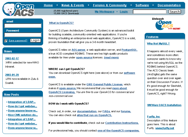
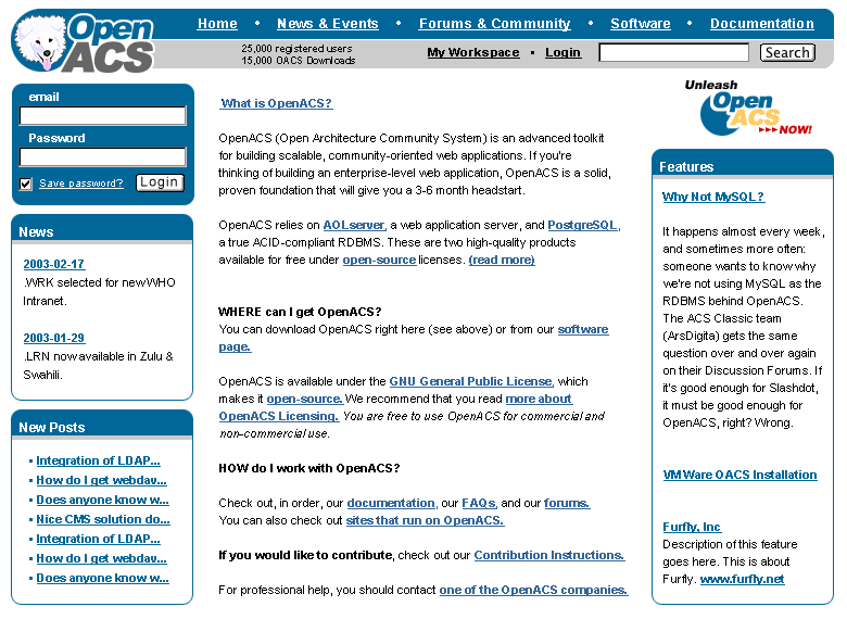
So here is a version where I added the Alex we know (I did tone down the "spikes") and changed that orange to a light blue that I could live with (just discovered that the blue I picked is not a web color... the closest color with the same effect was this grey #CCCCCC)

modified design (blue)
modified design (grey)

The Photoshop file can be found here: mainstudy03h.psd

If you can live with this we could probably get this design into the new site before launch (I should be able to help you on some of the adp work... unless you are already finished with it 😉.

Carl

P.S. Here is an excellent resource that we should take into consideration when creating the new site: Dive Into Accessibility: 30 Days to a more accessible web site. It also has a very interesting chapter on the safe use of color. A classic on the use of color in UIs can be found in chapter 9 of the Macintosh Human Interface Guidelines.

Collapse
Posted by Jun Yamog on
Hi Carl,

I am fasttracking this one because while its still hot maybe people would volunteer.  You know how it is in OSS communities.  Also maybe we could get results faster.  As proof of this we have another feed back from you.

Here are my comments about the issues above:

1.  Dog - I still like the Alex looking dog.  Its also toned down.  Some people has expressed removing the dog.  But that would not make Dog happy people like me accepting the decision.  A toned down and more realistic dog I think is better.

2.  As for the colors Blue and Gray is fine by me.  Although Talli's suggestion seem to be ok and some people tend to agree on it.  So I guess maybe a poll is in order for this item.  Yellow & Blue ok for me so is blue & gray.  Take note that we must also change the "Unleash OpenACS" color a bit to reflect the Blue and gray theme.

So anyway is issue #1 ok for you?  How about the others is the realistic toned down dog better for you?

If issue #1 is settled then we can just use a poll for issue #2.  Since I think this issue id not a design issue but a matter of personal taste.  Or maybe we can try to work the color scheme together.  I believe your idea of not having the color scheme to be too load to interfere with the content is correct.  But I think Talli's idea to differentiate our colors from others is correct too.

I will try to make a new color scheme and if you have time please also try different color schemes too.  Maybe its better not to have a poll but work on the color scheme issue.  Of course this is in the premise that we are ok with #1.

At any rate I am glad the direction of this design thing is going rather than going for a poll atleast we are putting in feed back from the community.

Collapse
Posted by Jun Yamog on
Hi Carl,
<p>
I have used Blue and gray for the headers.  I then added a maroon divider.  Also used the maroon for the boxes.  The header is now back to the 3d size as according to most 3f header was too small.  I have also realigned the header.
<p>
My failed experiments are using shades of green with blue or blue and gray.  Using warm colors like orange but as you have pointed out you don't want to make the it stick out.  I then ended up with maroon.  Has some contrast and life in it but not too much like the yellow.  I also tried to use gray on the boxes... it kills the life of the site.
<p>
Anyway I am awaiting final comments from you or any other big objections from others out there.  I wish we can use design 3g.  I am running out of air.  Lets try to move this one into adp.
<p>
<a href="http://www.infiniteinfo.com/openacs/mainstudy03g.jpg">Design 3g</a>
- <a href="http://www.infiniteinfo.com/openacs/mainstudy03g.psd">Design 3g PSD</a>
Collapse
Posted by Carl Robert Blesius on

Jun,

First of all... let me clarify.

conditional = dependent upon

Here is the image the present logo is based on...

I hope it is now obvious that the Alex replacements your designers are suggesting no longer looks like the original author of "the book". This is not just any dog Jun... it is Alex... a main author (if not the author) of a book with historical importance for OACS!

Leave the dog alone.

I have tried different color schemes Jun. I could not find anything except light blue or light grey.

So here is my suggestion: I ask you now to put your personal preferences aside a let some feedback on the modifications take place. I think we are really close to a solution that will work.

Collapse
Posted by Jun Yamog on
Hi Carl,

I am glad things our going better now.  But please let me clarify, the design is not based from my personal tastes.  It based from the feedback that I get and the professional work of Mikko.

I like the dog but some people did not like the dog.  Well a compromise was made.  Make the dog less prominent.  I will ask Mikko to look at the dog again and your current latest design that removed the black spikes outline.  I know your opinion count but so are others.  I am sorry but the dog will not be left alone.  But rest assure we will revise it to make it acceptable to you and others.

As for the color scheme have you seen 3g?  Its the best that I could do I have used blue and gray too.  Then put in some maroon as some people have said that they want something else other than blue.  I hope we get feedback.  In case we don't get good color scheme feedback is the color scheme of 3g fine with you?

Collapse
Posted by Malte Sussdorff on
Jun, Carl,

if you compare the two approaches they are very similar. Let me just say one thing on the dog though. Having spend six month with Alex, I would say that Carls new toned down Alex looks like Alex after we went for a walk in the rain and I scrubbed him dry. The other one looks more what I'd expect him to look after going to the beauty saloon.

As I think a lot of people (including me) get a little bit stressed out by the minor differentiations in the design, wouldn't it be possible to just call it a night and conduct a poll, starting on monday night, choosing between the two Alex and the two colour schemes. Seriously, we are not applying for a graphic contest. Just get it out and ready so we can launch with a new set of .adps. The longer we discuss, the less likely it will be that a new design will come out in the near future, as I think both Carl and Jun have other things to do as well, but changing designs every couple of hours.

I'm still curious how these designs could be made into an .adp 😊.

Collapse
Posted by Jun Yamog on
Regarding the dog... I took the real dog.  Filtered baked and diced.  This one is the real Alex...
<p>
<a href="http://www.infiniteinfo.com/openacs/mainstudy03j-2.jpg">Design 3j-2</a>
<p>
Of course I know people will complain that it does not look like a mascot or something... So here is the current Alex logo using the real Alex fur.
<p>
<a href="http://www.infiniteinfo.com/openacs/mainstudy03j-1.jpg">Design 3j-1</a>
<p>
There I hope people who like's Alex should find 3j-1 acceptable.  I used the real alex and logo.  I then super imposed the 2 and touched up Alex logo so the fur will not be like spikes.  I then rounded the neck area so it will look like that Alex came out from the "O" rather than being pasted on.
<p>
Like Malte said and I have said several posts ago can we move this one into adp.  As for the color scheme lets just adjust that on the adp... please.... volunteers for adp.  Lets move forward.
Collapse
Posted by Neophytos Demetriou on
As I think a lot of people (including me) get a little bit stressed out by the minor differentiations in the design, wouldn't it be possible to just call it a night and conduct a poll, starting on monday night, choosing between the two Alex and the two colour schemes. Seriously, we are not applying for a graphic contest. Just get it out and ready so we can launch with a new set of .adps. The longer we discuss, the less likely it will be that a new design will come out in the near future, as I think both Carl and Jun have other things to do as well, but changing designs every couple of hours.
Well, I agree with Malte. I don't mind which design is chosen but I want us to get it over with. A lot of people have contributed to this discussion/effort and it seems that we're reaching closure. I've talked to Jun at #openacs and emailed Don and we are ready to set a poll. If there are no serious objections, I will setup a poll by Monday afternoon. The options are only based on the color scheme. Here are the options as far as I can tell from this thread: Option 1 dog does not count it will use the more alex like dog of option 3.

Option 2 is Carl's color scheme. Jun have put in the real Alex on option 3 which will be used since Carl wants an Alex looking dog.

So only the color scheme is to be decided -- the basic design is done. If there are no serious objections by tomorrow, I'll setup the poll and announce it on the forums.

Collapse
Posted by Jun Yamog on
Amen to that!

It would be even better if... I vote for option X and will do the adp. :)

I may do the home page that wins to start things off (but a another volunteer would be nice).  Can someone sign up on helping with hunting down the working design of musea on the smaller pages.  And probably putting in the design where it seems appropriate?

Collapse
79: We'll do it (response to 1)
Posted by Ola Hansson on
Polyxena (my brother and I) will gladly do the adp work.

Just send me the cut-up bits and pieces of the winning design and we're off.

Collapse
Posted by Carl Robert Blesius on
Glad to see this comming to a close.
I like that dog Jun!  😊

Like I have mentioned above... the less color the better (I hope the grey blue
design with your last versoin of Alex wins the poll 😉

In any effect... I would be happy to do the chopping up into little pieces and
help out in any way I can on the adp (regardless of outcome).

Looking forward to it.

Collapse
Posted by Jun Yamog on
Ok I will cut the winning design.  If I have time I will do the header myself. Its a nice relief having someone volunteer for this.  Thanks Ola.  But Ola the site is the main thing like what me and DavB has discussed this is secondary.  We have a working design care of musea.

After the poll expect me to make revision "K" which is the winning design.  I will then cut it into pieces.

Carl,

I am glad the dog is acceptable to you.  My big dog version is not ready yet I may ask Mikko to clean it incase we will use this as the standard Logo.  I will email you and Ola once we get into the next step after the poll.

Its been a great wild ride!!!!!!  And it only just started.

Collapse
Posted by Ola Hansson on
Carl,

That's great. We probably won't need to trouble you with adp work, but now we know who to turn to.

If we can just get green light from Don, we'll start scetching on the adps, includes, etc - no need to await the poll result for that.

Collapse
Posted by Ola Hansson on
Excuse me Jun, I missed your posting...

We have time to do this in parallel to my migrating work, no problem. In practice it is my brother who will do the adp work😊.

I must have misunderstood you, though, because I thought you wanted a volunteer to do it instead of you... Sorry about that.

We still want to do it but probably won't need help besides the cutting and slashing, which of course is much appeciated! If it is Carl or you who does that part, really doesn't matter to us😊

Collapse
Posted by Jun Yamog on
Hi Ola,

I will just do the cutting I might not have the time to do the adp.  Expect my email soon.  I think we have clear winner from the polls.  We will use Blue & Gray.  I will integrate it with 3j-1 dog, using 3f header (this is what Carl used for his blue and gray design).  And do the finishing touches.

Expect the pieces in zip file.  I will also post up some crude doc how I sliced it and how I think you  should put it back together.

Thanks you and your brother for volunteering.

Collapse
Posted by Lars Pind on
Blue and grey looks like a winner, yes.

You probably all mean to already, but may I suggest that we use grey for the "Download OpenACS" graphic (or whatever it's going to say), too? Consistency is good, as Jun pointed out earlier.

/Lars

Collapse
Posted by defunct defunct on
Hey... is the poll already over??? That wasn't very long......

How many people have actually voted so far?

Collapse
Posted by Neophytos Demetriou on
The voting expires August 10. Waiting for the poll results would be better.
Collapse
Posted by Carl Robert Blesius on
Jun,

it may seem that blue+grey is going to win, but there is always a chance of a turnaround.

I insist on doing the finishing touches on the blue+grey design (this is time that I should donate, because I have pushed the design in the present direction and anything else would be unfair). I will create a link to the touched up version from the version that is presently being voted on so we can discuss the final small changes (like the link graphic) and how to cut it up (which should be pretty straightforward). I will also clean up the PSD file and post it in File Storage System (which we probably should have been using from the start).

Please send me the newest version of Alex in the highest resolution you have it, so I can get started. You seem pretty determined to make this happen yesterday 😉 and I would like to help you.

Collapse
Posted by Don Baccus on
Given that the discussion over new site design has at times resembled a civil war, isn't it appropriate that blue & gray appears to be in the lead? :)

(for you non-yanks out there, in the American Civil War the standard Army uniform of the Union was navy blue, that of the Confederacy gray, thus all sorts of "blue and gray" references run through histories and literature about the period)

Collapse
91: adp work in progress (response to 1)
Posted by Staffan Hansson on
OK, we've come a long way organizing the adp file structure for the new design. I'll be frank/blunt:

It's become evident by now that any unasked for help with adp work will in fact be no help at all - you good Samarians simply aren't tuned in with our new adp lay-up. So be warned; good intentioned but freelancing adp workers will be run over. It's a practical matter, nothing else.

Should we need help with the adp work, we've already received a kind, and even definite, offer from Carl to assist us. We'll be instructing him about our eventual adp needs, thus.

How the cutting up of images is organized is none of my business. However, I don't see the necessity of waiting for the definite result of the poll. Please start scissoring on the blue-gray version, and we can always change a few gray pieces into yellow in the end, if that's how it turns out. Waiting for the poll to time out translates losing a lot of time, obviously.

The actual fitting in of images into the code is likely to be a more cooperative effort between you designers and us adp-ers, I suspect. (We’ll need to know each color’s hex code and lots of other stuff.) We'll have milk and cookies then. After all, this is a _civil_ war.

Collapse
Posted by Jun Yamog on
Hi,

I have done the slicing. Although the poll is still running. I have done it so the Hansson brothers can start working on it. We can change the color scheme to Blue and Yellow in case it wins.

Ola and Staffan,

Go grab the stuffs:

Slices (7k only)
Some notes and helpful stuff
Source PSD

Good luck guys. In case you need some help just post here or lets just chat over IRC. I better go back to programming... design stuff are just too subjective for me.

Hansson brothers... isn't that the singing... never mind :)

Collapse
93: MMMBop (response to 1)
Posted by Staffan Hansson on
MMMBop, ba duba dop ba do bop,
Ba duba dop ba do bop,
Ba duba dop ba do. Oh yeah,
MMMBop ba duba dop ba do bop,
Ba duba dop ba do bop,
Ba duba dop ba do

Thanks Jun, now the chances are good that we'll have the new design ready for implementation in time for the mid-August launch.

Collapse
Posted by Jun Yamog on
Hi,

Neophytos told me that the post will expire tonight and to post in the results.

Blue & Gray wins.  out of 97 votes it got 51.5%

Here are the results:

https://openacs.org/poll/poll-results.tcl?poll_id=13

OpenACS volunteers starts to work as soon as the results got in... oh wow the design has been implemented at dev.openacs.org :)  Instant magic.