
Forum OpenACS Q&A: Response to openacs.org designs... opinion please
Jun,
You are really fast-tracking this one... wish I had more time to keep up with you, but I do not. So, out of respect for your stubborn determination I surrender on two conditions.
1. Leave the dog alone.
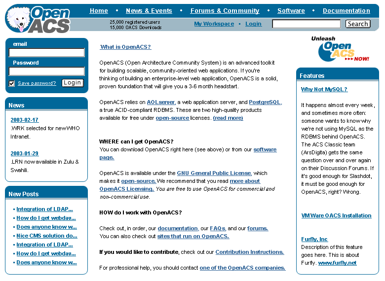
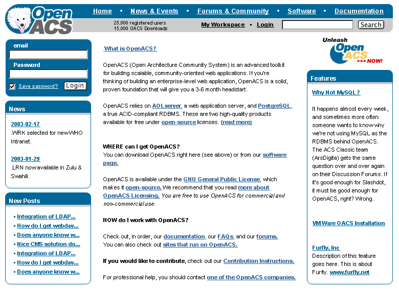
2. Less color... the content is where the color should be (both literally and figuratively). I do not want to have to look at two primary colors screaming at each other on every single page of the site. This is why shades of blue or grey would be better. Both are unobtrusive, they get out of the way and stay there.
So here is a version where I added the Alex we know (I did tone down the "spikes") and changed that orange to a light blue that I could live with (just discovered that the blue I picked is not a web color... the closest color with the same effect was this grey #CCCCCC)
modified design (blue)
modified design (grey)
The Photoshop file can be found here: mainstudy03h.psd
If you can live with this we could probably get this design into the new site before launch (I should be able to help you on some of the adp work... unless you are already finished with it 😉.
Carl
P.S. Here is an excellent resource that we should take into consideration when creating the new site: Dive Into Accessibility: 30 Days to a more accessible web site. It also has a very interesting chapter on the safe use of color. A classic on the use of color in UIs can be found in chapter 9 of the Macintosh Human Interface Guidelines.