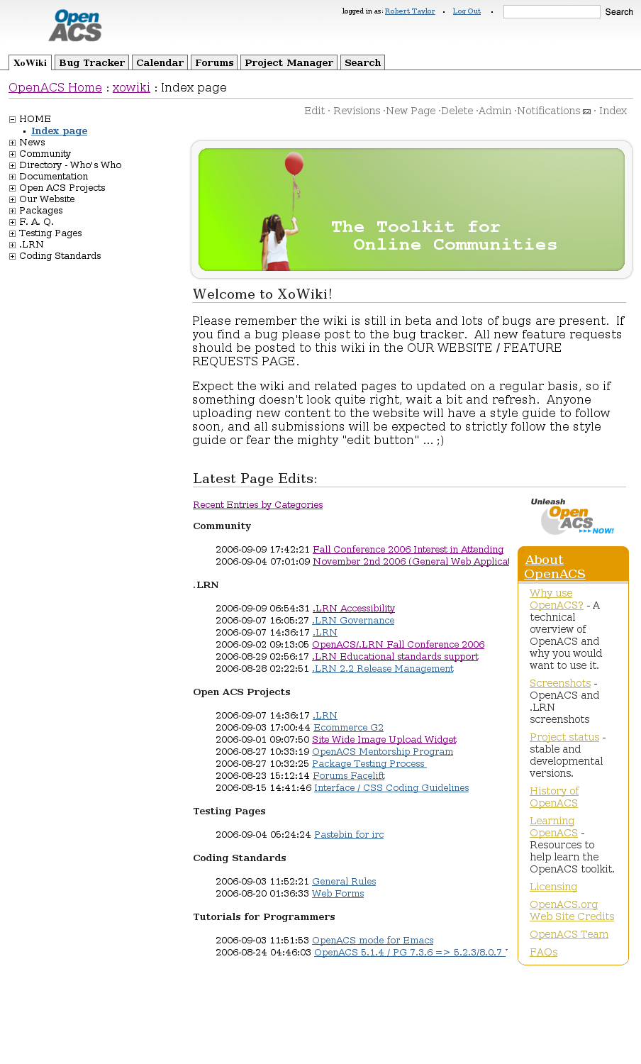
just playing around
Created by Robert Taylor, last modified by Gustaf Neumann 01 May 2020, at 11:36 AM
One stormy night I was bored ... and this was born:
1. Some links to other design work ideas:
a) http://www.thedesignexperience.org/openacs/oacs-design-hack.png
b) http://www.thedesignexperience.org/openacs/?=
c) http://www.thedesignexperience.org/openacs/image-library
2. I was playing around with a screenshot of openacs.org the other night and I wanted to see what the site would look like with the following criteria:
a) REUSE all standard OACS components. No funky layouts, no funky font work, just standard OACS out of the box layout and components.
b) SIMPLIFY the design. Don't change anything, just remove the unnecessary design components already present. We should NOT get caught up in a multimonth redesign sessions that takes forever to implement. Modify what we have and make it look unified.
c) Consider the UTILITY factor of the website. I don't want to think about the website as a 'special use case' of our toolkit. I would like to re-use our own tools as much as possible. Out of the box the site would default to XoWiki for the content management, we would have the bt, cal and forums tabs as normal. I was playing around with having a PM (pm needs some cleanup) and SEARCH tabs for advanced search and for project managing oacs based activities by those of us that want to use that tool.
3. The oacs logo was stripped of the alex graphic. It was kinda goofy and I'm going to try to work on something and see what I come up with. Maybe we can holda contest for the logo ... the joomla team ended up with a pretty cool logo as a result.
4. I will create a sample site layout here and make it available online live for evaluations by everyone.
5. Here is the sample i was playing around with:


