Filtered by category Documentation Non-Core Packages, 1 - 10 of 10 Postings (
all,
summary)
Created by Robert Taylor, last modified by Gustaf Neumann 01 May 2020, at 11:37 AM
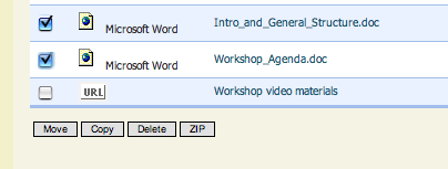
I added views support to file storage folder-chunk as can be seen here:

Furthermore I added the ability to download checked files (instead of having to download the whole folder). THe name of the zipfile will be the name of the folder you are looking at (so the same as if you download the whole folder).
As the file is zipped, this effectively lets you download a compressed ZIP file, so you don't have to download that much data.

Created by Ryan Gallimore, last modified by Gustaf Neumann 26 Sep 2019, at 08:34 PM
not to be confused with messages
Preliminary Specs for private-messaging package
Send a message or invite any online user from a textbox located at the top of every screen.
- User/Subsite Group selection widget.
- AJAX filter-as-you-type search "Smart Search"
- Confirmation for sending to entire subsite group.
- Message textbox
- Audio alert upon incoming message
"User is now online" messages.
- Incoming messages field with history (dropdown window)
- Send message to new online user via a link in history window
Users can block unwanted users or ignore all messages.
- "Block User" button
- "Unblock User" button
- "Ignore all messages"
- "Accept all messages" (except those from blocked users)
Created by Caroline Meeks, last modified by Gustaf Neumann 25 Sep 2019, at 10:20 PM
url stub: /assessment/asm-admin/
url: http://mgh.zill.net/assessment/asm-admin/
Current: 
This is the "top level" it should have links to things that are potentially used in all Assessments.
I suggest the following links in class = button style along the top.
[[New Assessment]] | [[Display Types]] | Categories | Actions | Requests | Permissions | Documentation
- We don't need to repeat the word "Administer" we are on the administration page.
- Remove the QTI upload, it is another way to create a New Assessment so it should be an option after you click New Assessment.
- Remove Export and Permissions from the list of Assessments. Those are options that have to do with one assessment and should be on that assessment's admin page Assessment_one-a.
Assessment Listing
Display the list of assessments as a sortable table. We have moved some actions to the Assessment_one-a page so lets use that real estate to give people information that might help them find the Assessment they are interested in.
Title Last Modified By Last Modified Date Request Permission
Created by Caroline Meeks, last modified by Gustaf Neumann 20 Oct 2017, at 05:25 AM
TODO LIST
- Update this page with the latest work
- Carl will fill in here...
The current UI is very confusing and cluttered.
Our vision of a final UI is that a assessment creator would pick a type of assessment he wants and the site will set all defaults appropriately for it. However, the first attempt to do this was a failure so we are working on an incremental approach that we think will provide value with minimal effort. Our intent is that later we move to an even friendlier UI.
Incremental Improvement Vision: The current user experience is: every time you create anything you are confronted by many many choices, most of which you can ignore. Similarly all the admin pages have many repeated buttons and its not clear when you want to do what. Thus our goal is:
- Creation pages are very very simple and useful defaults are set for everything.
- Objects then have one button to an Edit page that has all the complex things you can do with the object.
Related Pages:
Screenshots
These are screenshots of the work in progress.
Simplified quick assessment creation form.

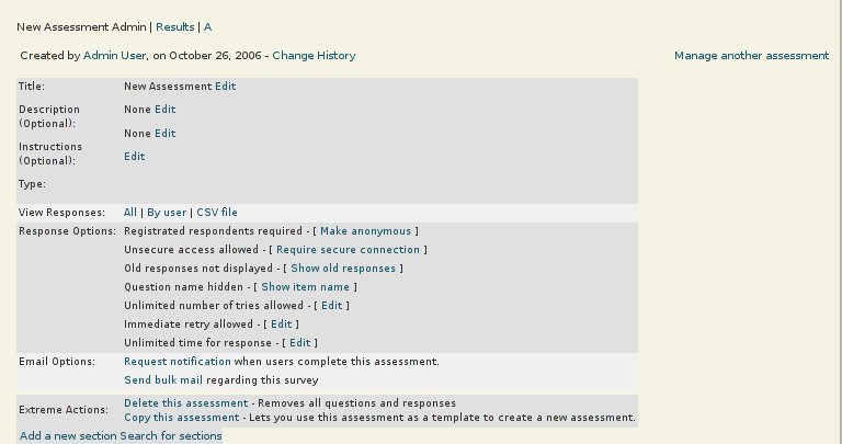
One Assessment Admin Page

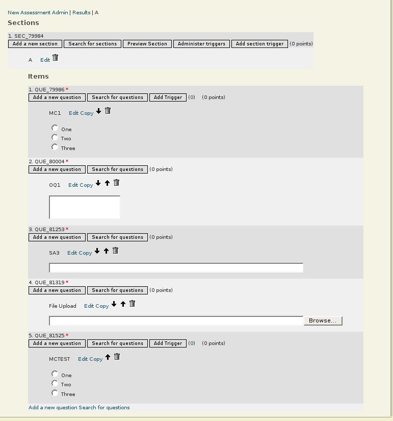
One Section Admin Page

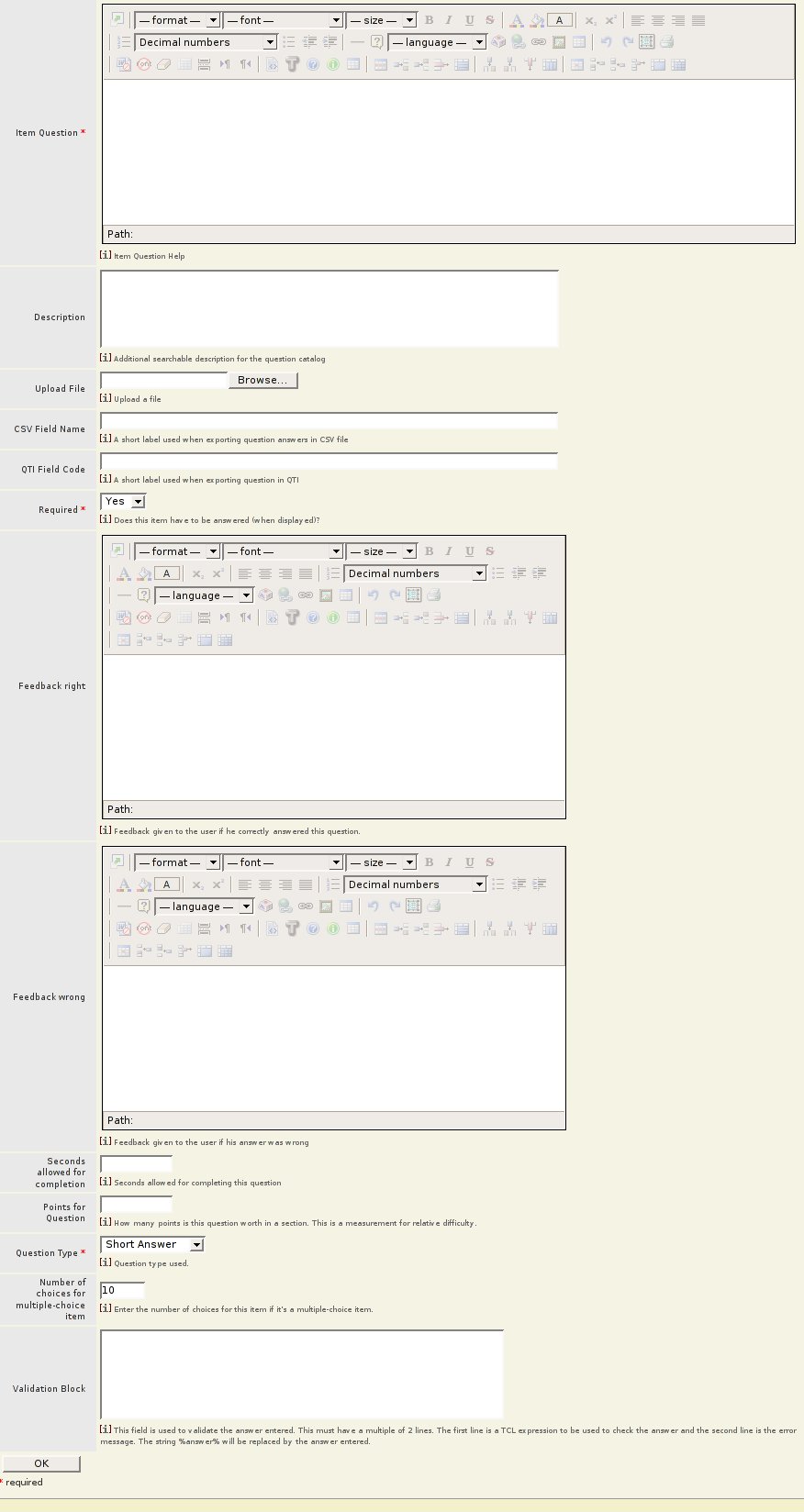
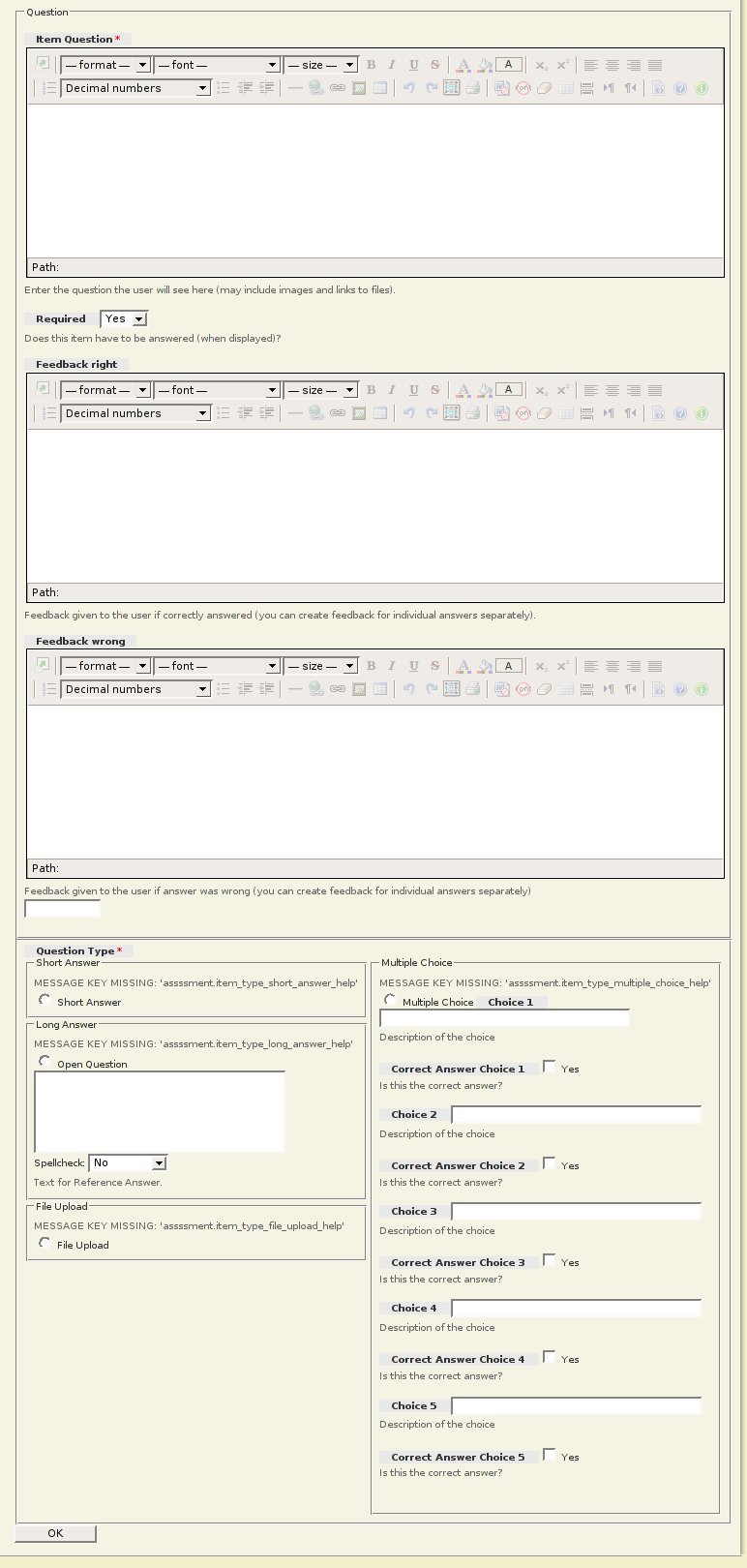
Add a question page.
First the original question form:

Now the new form. The question creation process used to require filling out 3 forms. We compressed it to one form by removing unused settings, and making intelligent default decisions. Some more work needs to be done. Assessment has a huge amount of complex features and it is not clear how they are used together to create a certain type of assessment. It is clear that all of the settings rarely need to be used together.

Created by Robert Taylor, last modified by Gustaf Neumann 30 May 2017, at 09:06 AM
The project manager package is used to log and track various aspects of projects in 3 typical (default) relationship categories of users (members): Leads, Participants and Watcher.
The project manager uses the Logger package to log hours and expenses by default. Any other units can be created and looged as need.
Created by Dave Bauer, last modified by Gustaf Neumann 20 Apr 2017, at 06:16 PM
Big Picture
We are not 100% sure that we understand everything a display can or should do.
What is clear is that: The assessment author should be able to pick from the predefined list of display types.
We think the display type is a first step towards a UI that lets you pick a type of test/survey/quiz etc. and then sets sensible defaults. But right now its pretty confusing. It doesn't seem to make a lot of sense as to what is controlled by the display type and what is a setting for a section.
Current Plans
We want to reorganize the display type attributes and the section functional attributes to make more sense.
Display types currently control some display attributes of an assessment section. Right now an assessment author can create a new display type which exposes confusing and complex attributes such as a chunk of ADP code to display the assessment. Because it can involve ADP code we are assuming at this point that creating a new display type should be done by a site-wide admin. So we intend to restrict access in the UI to creating display types.
Right now display types to be specific to the package instance level but its not clear that is the desired behavior, however we do not have immediate plans to change it.
Display type refers to the style of display. Right now it also controls the number of questions per page. This seems wrong, Number of questions per page, is a functional attribute and should be set per section. The number of questions should not be tied to how the questions are formatted. An assessment author should be able to use any number of questions on a page with any display type.
Future thoughts: (we are not currently funded to implement these ideas)
Recently the default adp template for an assessment form has been rewritten with semantic HTML that should be suitable for most display types. The visual design can be changed with CSS. This leads me to believe that display types should evolve into CSS style declarations instead of ADP code.
Right now display types are per package instance. In general we'd want site wide display types that can be used by any assessment author in any assessment package instance. For example, with dotlrn, each class has a separate assessment package instance, but the display types may be reused across the whole site.
Created by Caroline Meeks, last modified by Gustaf Neumann 20 Apr 2017, at 06:15 PM
url stub: /assessment/asm-admin/one-a?assessment_id=12309
A test example: http://mgh.zill.net/assessment/asm-admin/one-a?assessment_id=12309
Here is a new idea: Lets use a tabbed interface with the following tabs.
Assessment Name Admin | Results | Section 1 Name | Section 2 Name
Thus we can cut down on the really long pages and make it easy for people to move between sections.
Assessment Name Admin
On the one assessment admin page add in the export and permissions we took out from the top level admin page. Display the current values of all the many configuration settings an assessment can use. Since we now have sections and questions on another page we can use the space here to show these details and let people change them one by one. I believe this will be less intimidating then the current form which seems to ask you for 20 incomprehensible decisions right up front. Eventually we can add links to help text that would explain why you might want to use these different options.
Results
We aren't going to deal with the details of the results page right now, but in day to day operation the results are the most important most used part of the admin interface. It should be easier to get to and we should devote a full page to a UI for browsing and getting to the results you want.
Sections

New Look would be something like
1. Section 1 (SEC_12312) Edit | Preview | Triggers | Add New Section
- Lets either use icons or words in class=button. Mixing them is not working. I think words are easier for now.
- Search for a new section is a particular form of adding a new section. It should be an option AFTER you click Add New Section
- Edit Display types actually edits the package wide display type. This should be done from the top level page.
- Everything you might want to do with triggers can be dealt with after you click triggers.
- Moving a section should be done from the Edit page. We can present a UI that lets people say exactly what section they want this section to follow. Should be easier then incrementally using arrows.
- Delete should be an "Extreme Action" on the edit page.
Items (Questions)

New Look
2. Last Name ( QUE_4551) 2 triggers Preview
Edit | Move Up | Move Down | Delete | Copy | New Question
- Hide the details of the question until someone clicks Preview then use CSS to display the entire question inline.
- Searching for questions is a specific way of adding a new question so it should be an option on the new question page. \
- Trigger administration should be an option on the Edit page. I think we need to keep a visual reminder here when triggers are defined for a question as that is a pretty important and unusual event.
We can repeat Add a New Question and then below that Add a New Section at the bottom of the page for convenience. Remove all references to searching as per above.
Created by Ryan Gallimore, last modified by Gustaf Neumann 20 Apr 2017, at 06:14 PM
There seems to be a need in OpenACS for user-defined parameters. These might include customizing a menu, personalizing a site style template, or even removing or adding includes and panels.
Here's an initial brainstorm of possible field types:
- Personalized text - user defined text or titles, such as the title of a personal subsite homepage
- Turn on/off toolbar buttons
- Color picker
- CSS stylesheet
- Turn on/off includes (e.g. Solution Grove homepage)
- Change site theme (e.g selva) - is this possible?
The best part of this is that it is dead easy to add new parameters via the APM.
Please post your comments here.
Ryan Gallimore - Viscous Media
CM: What would the user facing UI for this look like? Parameters are such a horrid UI.
I was talking to a person from the MIT media lab who works on a site for kids there. Their site allows the kids to use the CSS personalization for My Space. This means that there are all sorts of cool themes for the kids without the site owners having to program them. T. The problem they have is that some of the themes have very very My Space specific things, like hide the 3rd table in the 4th div, which is of course quite different on their site then My Space's. Nevertheless, this is an idea we might want to use, making out stuff compatible either My Space or another system with a wide variety of themes so we get a lot of looks for "free"
Daveb: what do you mean by user-editable parameters? Do you mean "preferences"? Is this for administrators or regular users.
Ryan: by user-editable pages I mean regular users, and yes you could call them preferences, but users would be editing parameters directly in oacs. As far as UI goes, I think the current UI for parameters would work well - perhaps with more field validation.
Maltes: There exists a user_preferences table and this is where your custom applications should store it's values. Then just write a page with form callback hooks (look at callback::contact::special_attributes::ad_form_values::contract and callback::contact::special_attributes::ad_form_save::contract respectively in /contacts/www/contact-add.tcl) which will allow the packages to extend the form with the variables they allow the user to edit. This way you only need one page e.g. in acs-subsite /pvt/edit_preferences where the user can change all his / her user_preferences, including the ones already stored in this table. Each package would then (for each parameter it wants to have a user setting for):
- Extend user_preferences by adding the column
- Write a form extension callback implementation
- Write a form save callback implementation
- Add the code that deals with the parameter's return somewhere
Obviously it would make sense for the last step to have a cached procedure "user::get_preference -name -user_id". And we should probably enforce a naming convention like "${package_key}_$pref_name" so we are not accidentally running into name conflicts on the table.
Created by Antonio Pisano, last modified by Antonio Pisano 19 Sep 2016, at 02:10 PM
Created by Francisco Soler Lahuerta, last modified by sergio cubero 08 Oct 2006, at 05:49 PM
Datamanager allows to move other one objects of dotLRN of a class or community. Also it provides of the possibility of exportation of an object to a file or the import from another platform.
This process must be to be realized by the manager or teacher of the group, and this option is not available for the student.

